Devlog - Presentation / Graphics
Devlog – Presentation / Graphics
This devlog will focus on the graphics used in the game as well as other features that add to the presentation of the game.
Unless otherwise specified, all the artwork mentioned is original.
To start off with, the one background is used on the majority of scenes which is a plain scenic view of some trees and mountains and the sky (Figure 1). It was made to give of peaceful relaxing cartoonish feel to go along with the rest of the artwork in the game.
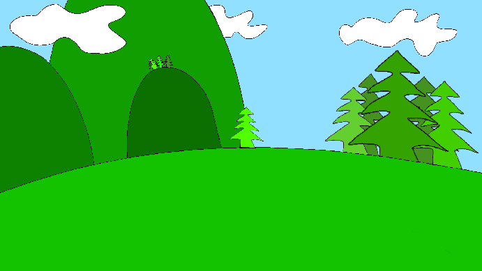
Figure 1. Background of the majority of scenes.
The only other background image used is on the title screen which is essentially the same image but with slimes in the foreground (Figure 2).

Figure 2: Title screen background.
The title of the game “Triple Slime” was drawn rather than using a particular font as it give more flexibility in its design. In this case it was a simple wavy design with a shadow behind it.

Figure 3. The title “TRIPLE SLIME”
The buttons and the gameboard boarder in this game uses the same artwork which is a plank of wood that has been stretched or shrunk to different sizes to match the criteria required (Figure 4, 5, 6). The font used on the buttons when displaying text in the game is not my own and is called “Life Is Goofy” (Fineberg, L n.d). It was chosen because it suits the cartoony feel of the game (Figure 6).
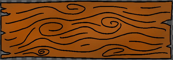
Figure 4. The artwork for the buttons and game boarder.
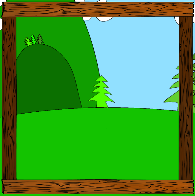
Figure 5. The game boarder.
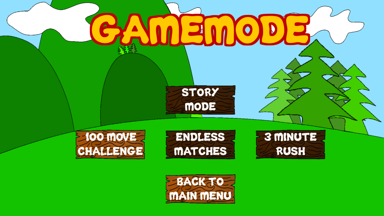
Figure 6. An example of the buttons and the font used in the game.
The only other original artwork added into the game is the artwork for the tiles or the slimes (Figure 7). Each slime was designed to have unique characteristics such as their colour and any accessories that they have.

Figure 7. Custom tile design.
However, once they were implemented into the game and replaced the stars as the tiles, the size of the slimes in game were too small to see the level of detail that was put into them. Instead, the tiles came out grainy and you could not make out the distinguishing features of the different slimes very well (Figure 8). This was also a sentiment shared by the people whom gave me feedback at this point in the games development.
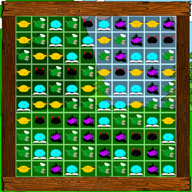
Figure 8. Custom art for slimes implemented into the game
In order to fix the problem, I decided to reinvent the slimes as a simpler object with thicker lines and instead of having accessories as distinguishing features, I implemented different shapes which is much easier to see at a smaller scale (Figure 9, 10).
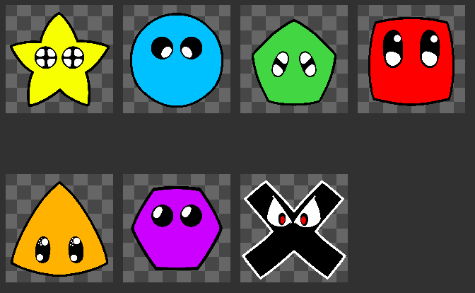
Figure 9. New design for slime tiles
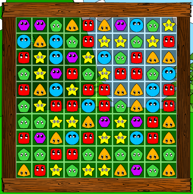
Figure 10. New slimes in game
Feedback
As mentioned above, at this stage feedback received mentioned that the slimes were too grainy and difficult to distinguish between the different features in each of them so they were changed to more simple designs.
The feedback also mentioned that adding an explosion type effect to when the slimes are destroyed would add to the feeling of the game. To add an explosion type effect, I added a particle system that plays when the slimes are destroyed (Figure 11). In addition to the explosion effect added, I also added a “pop” sound when the slimes are destroyed to give some audible feedback about the users actions (unfa 2014).
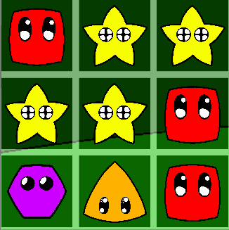
Figure 11. Explosion animation
References:
Fineberg, L n.d, Life is goofy Font, viewed 30 April 2021, https://www.1001freefonts.com/life-is-goofy.font
unfa 2014, Cartoon Pop (Distorted), viewed 8 May 2021, https://freesound.org/people/unfa/sounds/245646
Leave a comment
Log in with itch.io to leave a comment.